
Sales dashboard
Turning raw data into an accessible and useful visual dashboard for market and sales insights, improving business relations, and increasing profits.
Role
Product designer
Client
Ambev
Year
2020


The project
Many wholesale and market data are collected in the purchase moment and transmitted from providers in raw table format. The client contacted us to translate it into a better visual representation, aiming to make it more accessible for different employee profiles, assisting them with investment choices and negotiation strategies, and bringing an overview of the performance of the retail and wholesale stores.
What I did
-
Wireframes and visual concepts for initial pitch and validation;
-
User interviews to understand workflow, their needs and data interaction;
-
User workshops to validate hypothesis and usability testing;
-
Desktop and mobile interface design, keeping close contact with software engineers;
-
Assisting nationwide user training
Outcomes
For users
75%
less manual actions
For the client
60%
more access to sales strategy
For our consultancy
3x
increased profit
Main objectives
-
Design two different dashboards for distinct user profiles: Nationwide Key Account Managers and their assistants, considering different levels of experience and skills.
-
Translate rough data sent from provider into a better visual focusing on strategy
-
Deliver the desktop versions in 3 weeks
-
Learn both providers' and clients' business terminology
-
Follow specific tech requirements, as the interface had to be replicable inside Power BI tables

Getting sponsored
We had to create an initial concept to guarantee the internal sponsorship for our client.
We synthesized and clustered correlated data into groups to create wireframes and a visual concept for validation with stakeholders and developers.
With their approval and funds raised to continue the project, we proceeded to test it with users during interviews.
Talking to users and collecting
great insights
We conducted qualitative interviews to understand users' workflow combined with navigation within two different prototypes to collect insights.
Our main discoveries:
-
The way they analyzed data varied a lot from team to team and even more from region to region inside the country.
-
The lack of standardization of market analysis had an impact on profits, performance, and distribution of investments.
-
Some users had a deep analytical profile and already created weekly visual reports inside Excel for their teams.
-
Others took an average of 2,5 hours every week to gather data, analyze it and create reports.
-
The dashboard had an educational purpose as well and could be used for training new analysts
Dark or light mode?
Once considered the best choice for saving battery as the users were always on-site visiting clients, it was not their main choice because they had to export these reports and send them by email, opting for a white background as it looked better attached to the message body.
.png)
.png)
The prototype improvements
-
Some visualizations had to be changed, as labels and detailed numbers were very important, after the comma.
-
Interdependent data existed and others made more sense when seen together.
-
Showing better investments, filtering, and exporting the report were new very important features for them.

First extension
Our research insights showed such value that we got our first extension in time for the contract and attracted more funds to the project giving us more time to user validation.
Validation hands-on workshop
We updated the interface and ran a live final validation workshop with a group of 15 users, where we presented the screens and allowed them to manage data inside the dashboard.
Workshop insights:
-
The same screen with minor differences would fit both users' needs, as they worked closely together and many assistants split the tasks with their Key Account Managers, so both accessed chain and store data.
-
As they would split tasks, we had to add more filters to personalize their experiences adapting to different teams working dynamics
-
There were different degrees of experience and knowledge in data analysis, so we collected frequently asked questions to fill the tooltip's content explaining how each card worked.

Second extension
The workshop had a huge impact on the company and we got a second extension in contract with a new round of funds. The focus now was to deliver also a mobile version and support our client with training sessions.
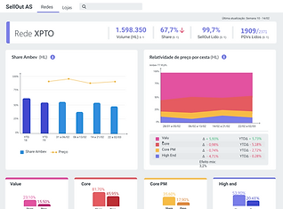
Final result
Other features
-
Accessibility: All data was labeled with tooltips explaining calculation memory used in each session and explaining the specific terms.
-
Standardized vision: highlights with the main performance data above and the data granularity increases as the user scrolls down.
-
Personalization: flexibility with filters and different exporting formats improve business communication
.png)